The Washington Post reports: “Arctic ice extent has been in decline every year since scientists started recording it in 1979.”
For good effect, the Post presents the following dramatic images:

So, is it true that the arctic sea ice has declined every year since 1979?
No, it isn’t.
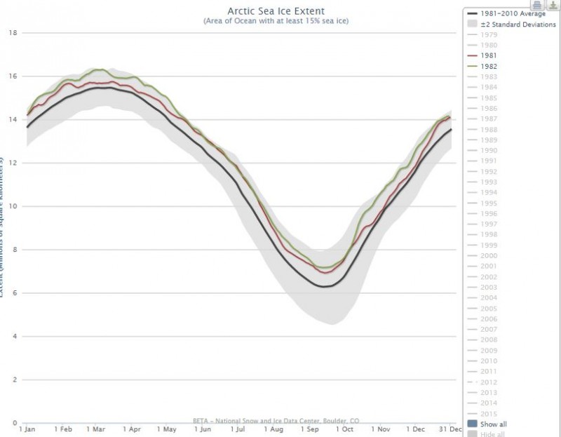
All one need do to see that is visit the Post’s source, the National Snow and Ice Data Center, and click the different years on the graph they provide to see that there have been increases as well as decreases in the ice extent from year to year, as you can see in this example comparing 1981 (red) with the greater extent of 1982 (green):

So the Post lies, but let’s give it the benefit of the doubt and assume that was just sloppy, inaccurate wording, and what they really meant is that the trend has been dramatically downward — something their graphic doesn’t show.
Has it trended downward? Yes, certainly. Dramatically so? Well, here’s what happens when you put NASA’s own data into Excel and graph it (they provide a mean figure for 1979 through 2000):

Nothing to get alarmed about.
Now, here’s something funny. Go back to the NIDC website and take a look at the graph for the Antarctic and compare 1979 (blue) to 2014 (green):

That’s right, the extent of the antarctic sea ice was greater last year than in 1979.
But, of course, you aren’t seeing dramatic graphic images of that in the mainstream media.
But let’s not play their own tricks. What matters is not two arbitrary data points, but the trend. So what’s the trend been? Again charting the NASA data, we see:

It’s been increasing.
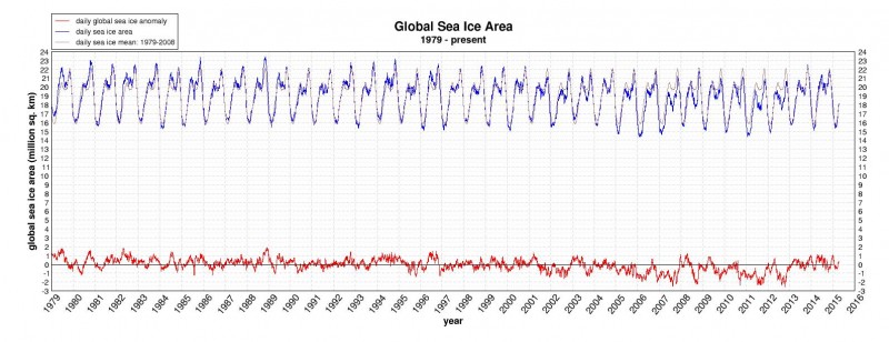
Here’s a graph of what global sea ice area has looked like since 1979 from the Arctic Climate Research website of the University of Illinois:


